Portfolio / Building a Dashboard Offering That Sells
Building a Dashboard Offering That Sells
Transformed Yonder's
dashboard offering into a scalable, revenue-driving product.

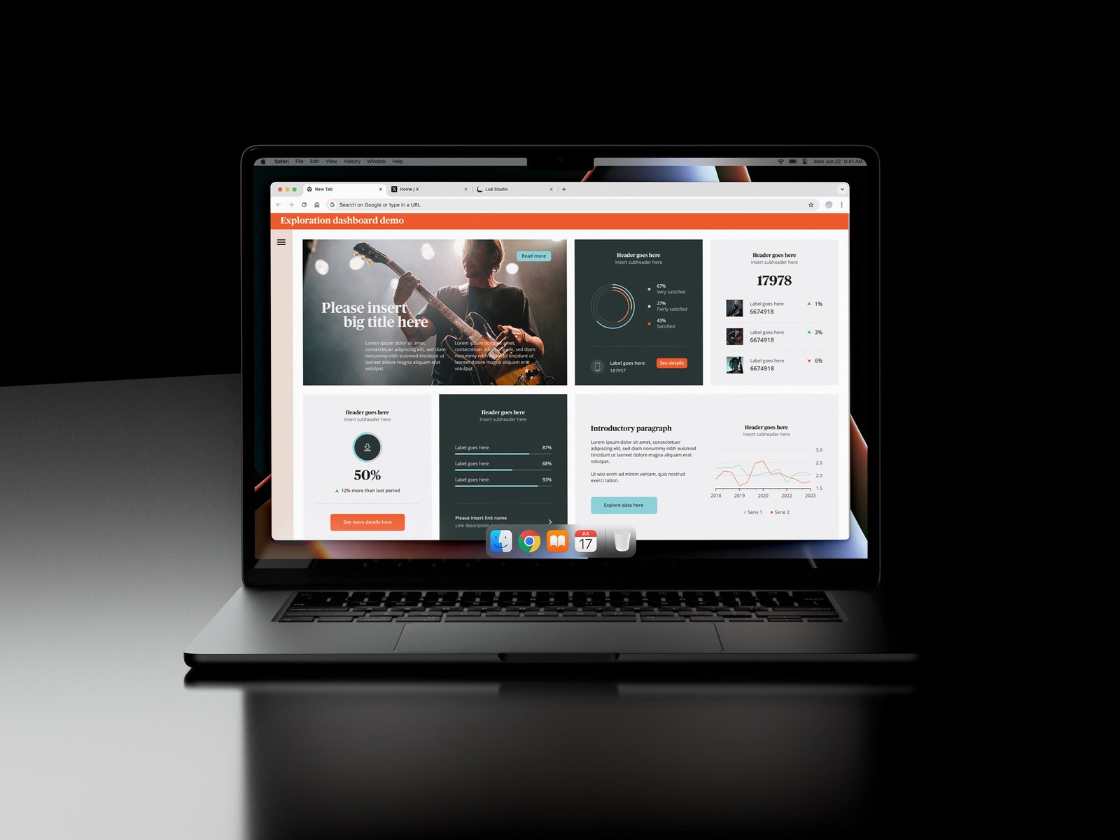
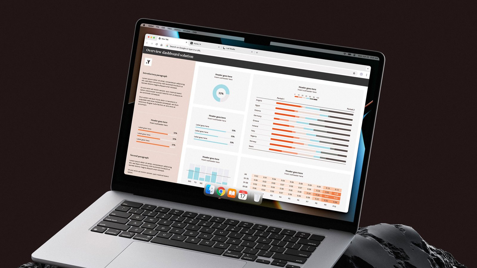
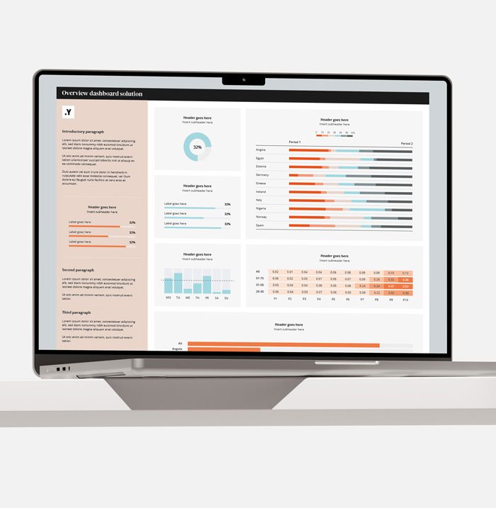
Yonder Data Solutions helps organisations capture reliable insights through online and telephone research (CATI), generating the data that supports smarter decision-making. However, collecting data is only part of the challenge. Transforming it into something people can easily explore, understand, and act on is where real value is created.

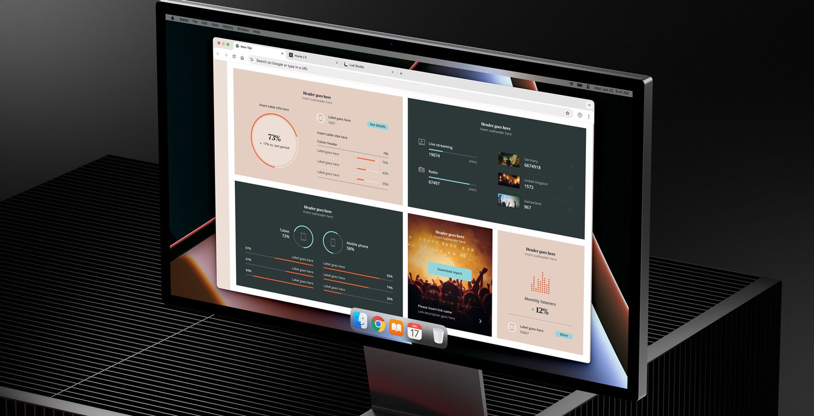
I joined Yonder to reimagine their dashboard solutions, turning complex datasets into intuitive and visually engaging tools. Each chart, graph, and visualisation was carefully designed to simplify information, highlight patterns, and help teams engage with data more confidently and effectively.

What We Achieved
Results spoke for themselves: the dashboards quickly became a key business asset, driving increased client engagement and demonstrating the power of design-led innovation.

Their success set a new standard for how Yonder presents and leverages data, shaping the future of their analytics offerings.
Visual Dashboards Turn Complex Data
into Clear, Actionable Insights
0 %
Faster decisions. Teams act quicker
when insights are clear and visual.
0 x
Faster comprehension. Our brains
process visuals far faster than text,
making complex data instantly understandable.
0 %
Better information access. Visual dashboards help teams find the right data, right when they need it.
Process

I started by understanding the data, the business objectives, and how teams needed to use the insights. Through research, analysis, and close collaboration, I mapped user journeys to ensure each dashboard felt intuitive, relevant, and tailored to real workflows.

Ideas

I transform raw data into visually engaging charts, graphs, and interactive elements that make complex information easier to explore, understand, and act on. Each solution is designed to help users uncover insights faster while creating a more intuitive and engaging data experience.

Experience

With years of experience designing dashboards across industries, I combine data understanding, visual design, and usability principles to create solutions that are not only visually compelling but drive meaningful business impact.

Make Insights Work
For You

Unlock the full potential of your data with dashboards that do more than display numbers. By turning insights into interactive, easy-to-explore experiences, you empower your teams and your customers to act faster, make smarter decisions, and see the story behind the data.

Adding dashboards to your offering is not just an upgrade, it is a way to transform information into value, engagement, and impact.

“Redesigning our dashboard solutions was a pivotal move for our business. The new approach not only improved user experience but also turned our dashboards into a valuable commercial offering.”

Chief Technology Officer, Digital Solutions

Get in touch
I work with global brands
from startups to industry
leaders. Let’s talk
Social
Location

Copyright © 2026 Numbers and Colours. All rights reserved.

info@numbersandcolours.com

Let's chat about your project.

Main office

This site uses cookies to offer you a
better browsing experience.